Search Instagram for "Accidentally Wes Anderson" and you'll find a community of 1.4 million people who travel the world looking for places that already look like a Wes Anderson movie. Pink hotels in Lisbon. Symmetrical Soviet-era subway stations. A seafoam-green diner at golden hour. The aesthetic has become so recognizable that strangers can frame a photo of a parking garage and the comments will all say this is so Wes. So what is it, exactly?
The five decisions, repeated
Anderson's entire visual language can be reduced to five decisions, made the same way in almost every shot of every film. Master the five and you can frame an Anderson photo of a Walmart parking lot.
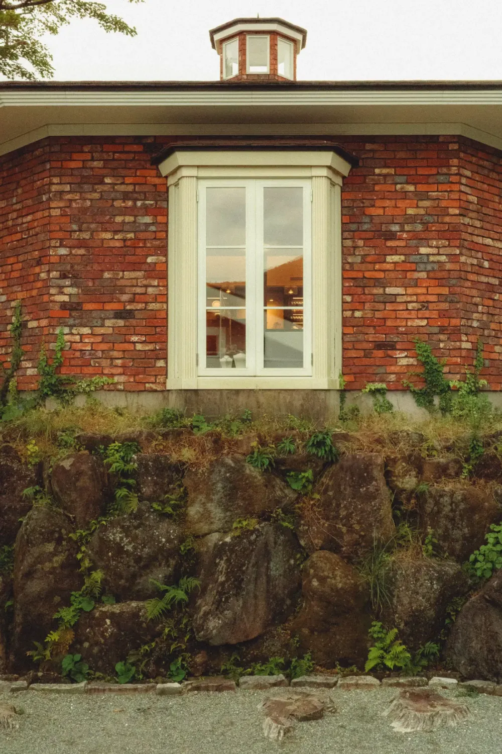
1. Perfect symmetry, head-on
The camera is placed dead-center of the subject. Doorways are framed from directly in front. Faces look directly at the lens. The composition is bilateral — what's on the left mirrors what's on the right. The viewer's eye doesn't have to wander to find the subject; the symmetry hands it to them.
This is the easiest rule to apply and the one most amateur photographers miss. Most people frame slightly off-center because that's how the eye actually sees. Anderson breaks the eye's habit by going rigidly central. The result feels deliberate, almost stage-set.
2. Pastel-dominant color palette
Pink, mint, cream, lavender, ochre. Anderson's colors come from old Kodak film stocks (Kodachrome 64, Ektachrome) processed with a slight warm shift. Modern phone photos look digital-blue; pastel-shifting the white balance toward pink-cream-yellow drops everything into Anderson territory.
The trick is that pastels don't mean low saturation. They mean shiftedsaturation — pulling the blues out and pushing the warms in. A Wes Anderson photo of a cloudy sky still has color; the cloud isn't gray, it's cream.
3. Deep focus, not shallow
This is the most-missed rule. Modern portrait photography is shallow depth of field — face sharp, everything else blurred. Anderson does the opposite: everything in the frame is in focus. The wallpaper is sharp. The lamp in the background is sharp. The coffee cup on the table is sharp.
Deep focus is how stage photography and architectural photography work. It tells the viewer: everything in this frame is part of the composition. Look at all of it.
4. Flat, even lighting
No dramatic shadows. No golden-hour glow. Anderson's scenes are lit so evenly that shadows almost disappear. The viewer can't tell what time of day it is. The light feels like daylight through a soft-box.
For phone photos, this means shooting in overcast outdoor light or bright indoor light with diffused windows. Avoid direct sun. Avoid single-point indoor lamps.
5. The square or 4:3 crop
Anderson rarely shoots 16:9 widescreen. Most of his iconic frames are roughly square or 4:3 — even in a 2.39:1 cinema film, the important action lives in the central square. The square forces the symmetry to read; widescreen lets the eye drift.
The recipe, applied to a phone photo
Take a phone photo of any building, room, or object. Process in this order:
- Crop to 1:1 square or 4:5 portrait. Center your subject precisely — use the gridlines.
- Apply a warm pastel tint via Kodak Gold 200 film border. The Kodak preset adds the right yellow-warm cast Anderson uses; the border itself is optional but reinforces the film vocabulary.
- Add a clean Polaroid frame in classic white or vintage cream. Wes Anderson frames have implicit borders (the cinema screen does the framing in his films); a polaroid edge does it explicitly for a still photo.
- Skip the shallow blur. Resist the urge to add background blur — it breaks the deep-focus rule. Wes Anderson would not portrait-mode this.
Why this aesthetic is so steady
Most aesthetic trends burn through their moment and disappear. "Accidentally Wes Anderson" has been growing year over year since 2017 with no sign of slowing. The reason: Anderson's visual rules are rules of composition, not rules of fashion. Symmetry, balance, color discipline, light control — these have been photographic principles since Daguerre. Anderson didn't invent them. He just applied them consistently.
That's why parking garages can look Anderson. The rules apply to any subject. The aesthetic is a discipline, not a costume.
The deeper read
The reason a phone photo of a pink wall in Lisbon stops you mid-scroll is that someone took a moment to apply five small discipline-rules most people don't. Five seconds of intention turned a parking lot into a composition.
Most of what we call "aesthetic" is just attention.